Editorial
Magazine and quarterly work — spot illustrations and single pieces built around a short written brief.
Bold shapes, small stories and a few colours that keep finding their way into the picture.
Pip Parade brings everyday scenes and curious characters together through flat colour, loose outlines and a little visual humour. A shared table, an oversized coat or a shelf of kitchen things can become the start of a story.
Cut-paper shapes carry the larger forms; loose ink picks out the smaller details. Cobalt, tomato, lemon and teal repeat against warm paper across editorial, publishing and packaging concepts, giving six different subjects a shared visual voice.
Magazine and quarterly work — spot illustrations and single pieces built around a short written brief.
Picture-book spreads and interior pieces — character and still-life compositions built for a book trim.
Label and shelf-panel artwork — compositions built to survive cropping, tiling, and small-scale print.
In The Midnight Pantry, the cat, teapot and moon give the scene three clear anchors. Curved shapes repeat in the bowls, fruit and leaves, while a little paper texture softens the larger blocks of colour. The composition suggests a packaging application without hiding the illustration behind a product mockup.
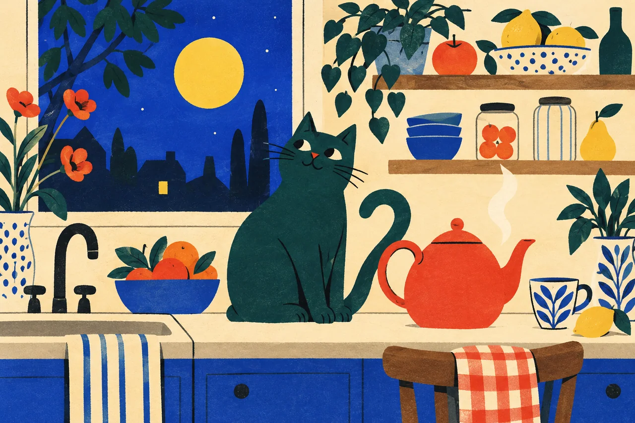
A teal cat keeps watch beside a steaming red teapot. A round yellow moon, blue bowls, trailing plants and fruit turn the nighttime kitchen into a cheerful illustrated scene.